Oumai

Client
Oumai
Sector
Health & Wellness
Year
2025
Services
Visual Identity
About the Brand
Oumai is a Czech-based sexual wellness brand that encourages people to explore their sexuality freely and without shame.
Its mission is to create a safe, welcoming space where conversations about sex and self-care feel natural, informative, and empowering.
The Challenge
The visual identity needed to reflect Oumai’s core values: elegance, quality, and openness.
Our Approach
The logotype’s minimal, fluid lines convey sophistication and sensuality, while the circular emblem symbolises unity, wholeness, and balance - key ideas in self-pleasure and body connection.
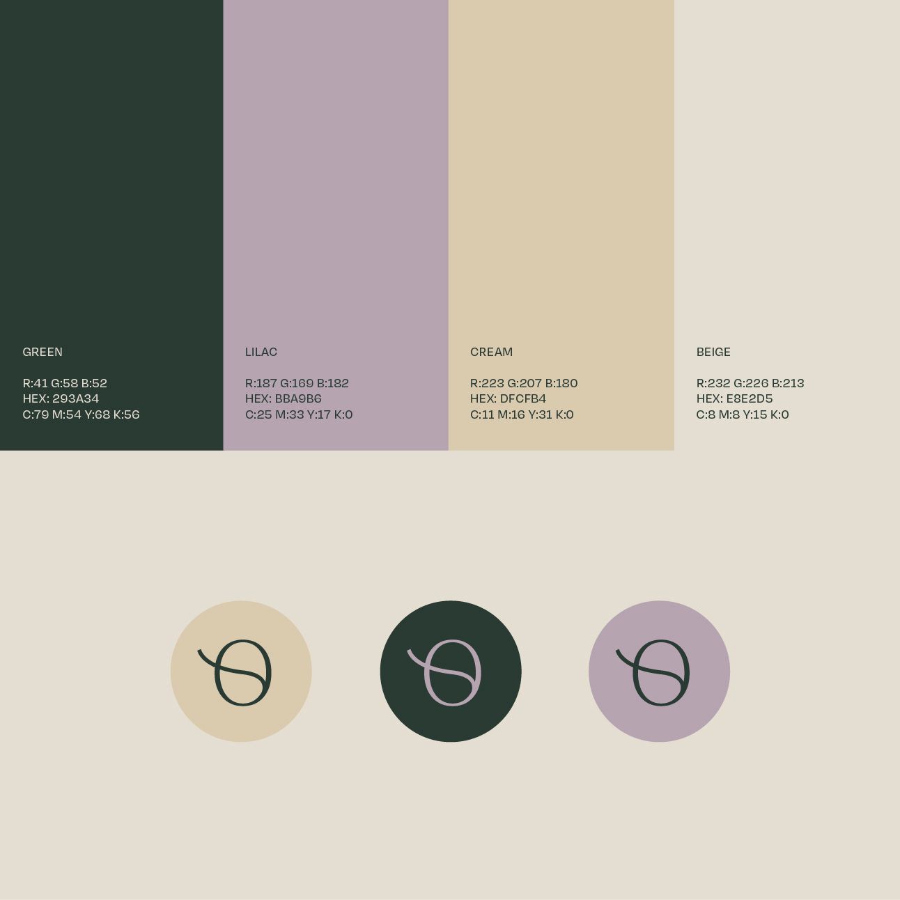
A soft yet confident colour palette of deep green, lilac, cream, and beige evokes calmness and intimacy, creating an aesthetic that feels luxurious yet approachable. These tones also support Oumai’s dual focus on high-quality products and stigma-free education.
Imagery is intentionally refined and feminine, celebrating touch, connection, and natural pleasure without over sexualisation.
The Result
The final identity is cohesive, feminine, and modern - a visual experience that invites curiosity, trust, and self-discovery.


About Mindful Brand
Mindful Brand® is a brand-led business advisory guiding first-time B2C female founders from brand uncertainty to brand clarity.